Japandi interior design is what happens when two of the world's most disciplined design philosophies stop competing and start collaborating. Japanese wabi-sabi — the art of finding beauty in imperfection, transience, and restraint — meets Scandinavian hygge — the pursuit of warmth, function, and cozy togetherness. The result is a space that feels simultaneously calm and inviting, minimal but never cold, curated but never precious. In 2026, the Japandi interior style has moved well beyond trend status into a fully established design language, complete with new sub-directions like Dark Japandi and Biophilic Japandi that are reshaping how the look is executed.
This guide breaks down the philosophy that makes Japandi work, the exact materials and colors to specify, the furniture principles that define the style, and room-by-room strategies for bringing this Japan-meets-Scandinavia fusion into your home. Whether you are starting from a blank canvas or editing a room that already leans minimal, these are the decisions that separate a genuine Japandi interior from a simply beige one.
Two Philosophies, One Shared Truth
Understanding Japandi requires understanding the two traditions it draws from — not as aesthetic categories but as ways of living.
Wabi-Sabi: Beauty in Imperfection
The Japanese concept of wabi-sabi celebrates transience and irregularity. A ceramic bowl with a visible firing mark is more valuable than a machine-perfect one. A wooden surface that shows its age tells a story that a lacquered finish cannot. In a wabi-sabi interior, materials are left honest — raw, unfinished, allowed to weather — and empty space is treated as a compositional element, not a gap waiting to be filled. The related concept of ma (間) — intentional void — means that what you leave out matters as much as what you put in.
Hygge: Warmth and Togetherness
The Scandinavian contribution brings warmth that pure Japanese minimalism sometimes lacks. Hygge is not about candles and blankets (though those help). It is about creating conditions for comfort and human connection: layered lighting that pools in warm zones rather than flooding a room uniformly, soft textiles that invite touch, and functional objects — a coffee mug, a reading lamp, a wool throw — that earn their place through daily use. Nordic design also contributes functionalism: the principle that beauty should arise from use rather than decoration, which aligns with the Japanese concept of yō no bi (用の美, "beauty of use").
Where They Meet
Both traditions share a reverence for natural materials, a suspicion of excess, and a belief that a room should be edited rather than decorated. Japandi finds the middle ground: fewer objects than a typical Western home, more warmth than a strictly Japanese one. The connection between these cultures goes back further than the trend — Danish furniture designer Kaare Klint studied Japanese joinery in the early 20th century, and Finnish architect Alvar Aalto drew on Japanese spatial planning for residential projects. The label simply gave an existing conversation a name.
The 2026 Japandi Color Palette
Color is where Japandi shows its discipline. The foundation is a grounded, earthy range — not the flat grey-and-cream combination that marked the early 2020s but a warmer, richer version that has evolved significantly.
Foundation Colors
Build your base from three to four of these neutrals and repeat them throughout the room until the scheme feels inevitable rather than decorated:
- Warm white — not brilliant white, not yellow; think plaster or unbleached linen
- Sand and oat — the warmest neutrals, replacing the cool greys of earlier iterations
- Greige — grey with a brown undertone, roughly the #C4B5A5 zone
- Mushroom and taupe — mid-depth neutrals that ground a room without darkening it
- Warm grey — softer and less industrial than the cool greys of standard minimalism
Accent Colors
Used sparingly as grounding notes, never as dominant tones:
- Muted sage — the green that reads as natural rather than decorative
- Terracotta — the 2026 shift toward warmth has made this a go-to accent
- Charcoal — deep enough to anchor a composition without the hardness of black
- Deep olive — appearing in Dark Japandi interpretations
A quick test for your palette: if you can name every color in the room in one breath, you are on the right track.
The 2026 Warmth Shift
The biggest color evolution this year is deliberate warmth. Honey-toned white oak has replaced cooler blonde ash. Aged brass hardware has replaced matte black. Muted terracotta appears as an accent rather than a neutral. Rooms now read as warmer and more inviting without losing restraint and negative space. If your existing Japandi room feels cold, the fix is usually swapping cool-grey accents for aged brass or terracotta and choosing warmer wood tones.
Furniture: Low, Honest, and Intentional
Japandi furniture follows rules that are structural, not trend-based.
The Height Principle
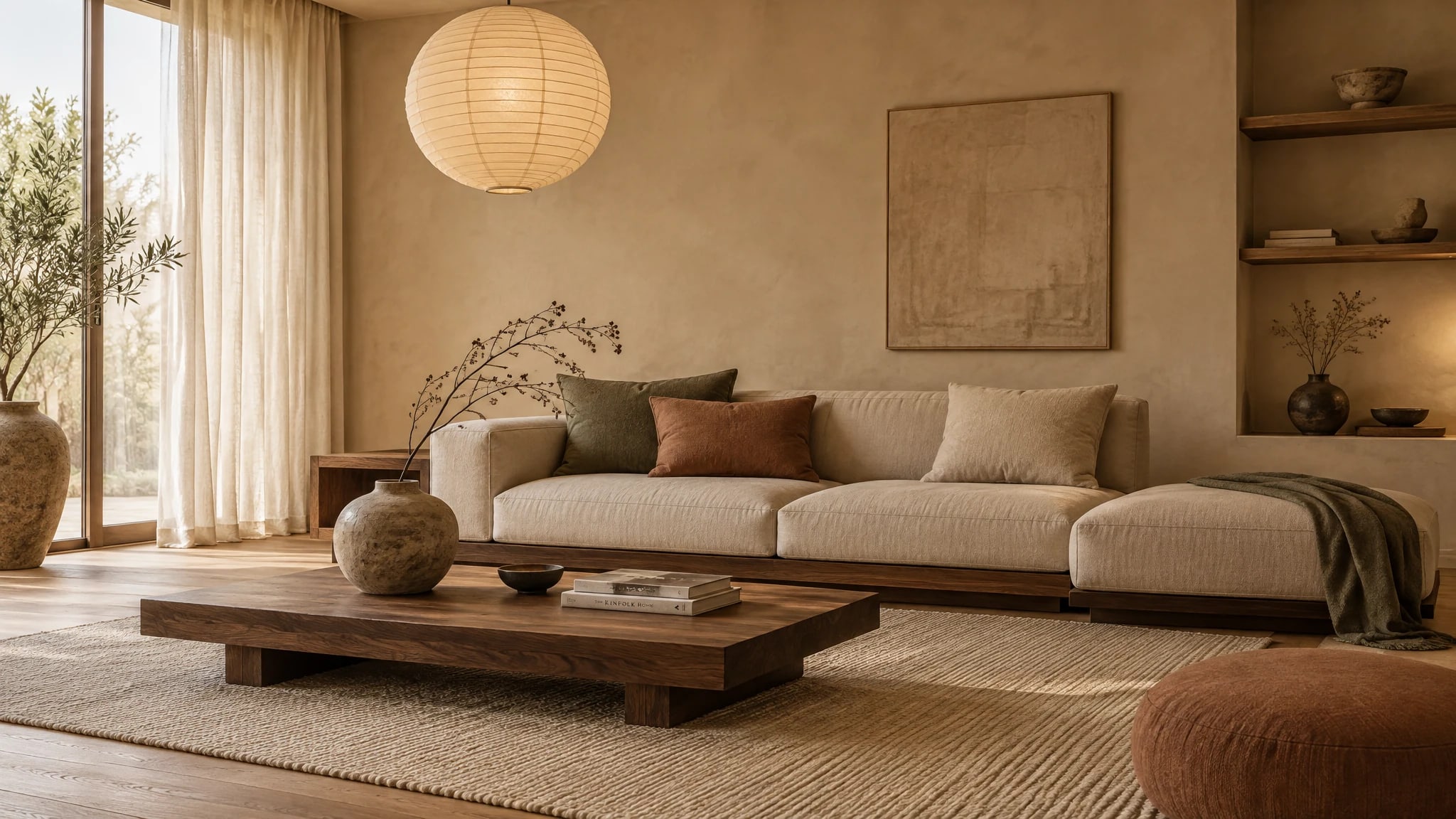
Furniture sits low. Sofas at or below 70 cm seat height. Coffee tables at 35–40 cm. Beds on low platforms or directly on slatted frames without tall headboards. This is not arbitrary — Japanese living traditionally happens close to the floor, and keeping furniture low preserves sight lines and makes rooms feel larger. The 2026 evolution adds curves: rounded sofa arms, arched shelving, and curved dining chairs that soften the rigidity of straight lines.
Material Honesty
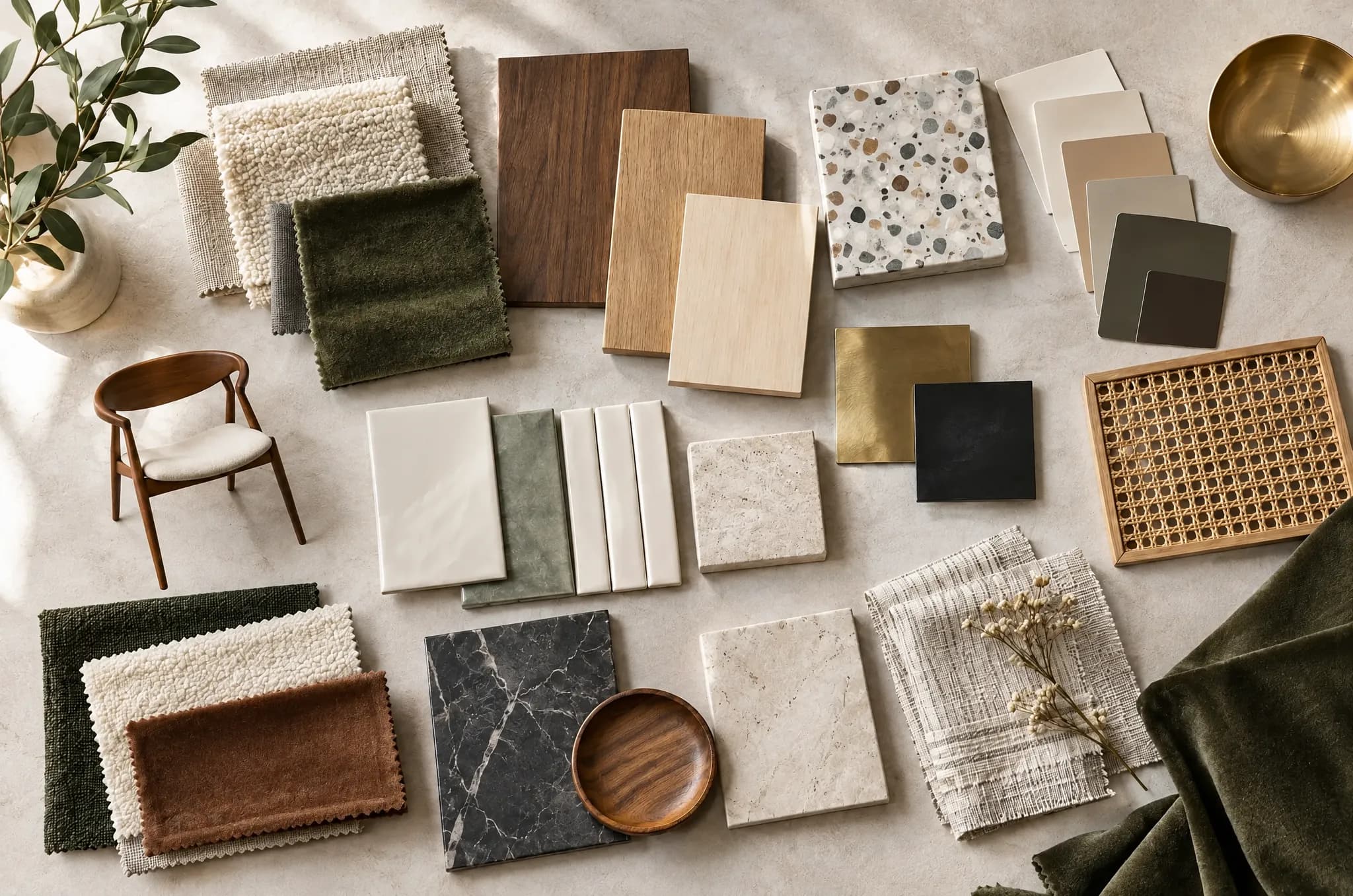
Wood should look like wood — never lacquered, never high-gloss. White oak with its honey tone and tight grain is a Japandi favorite, but any timber that wears its character openly works. Around it, layer the naturals: linen and wool for softness, stone and clay for weight, ceramics and rattan for texture. The absolute ban list: lacquered wood, synthetic textiles, and high-gloss ceramics. These break the material honesty that defines the style.
The Five-Object Rule
On any given surface — a shelf, a console, a coffee table — limit displayed objects to five or fewer. Each piece should either serve a function or carry genuine meaning. A handmade ceramic vase with a single branch. A stack of books you actually read. A candle that shows evidence of use. This is the difference between Japandi editing and Western minimalism emptiness: the objects that remain have presence and story.
Concealed Storage
What you do not display, you hide completely. Closed cabinetry with flush or integrated handles, built-in wardrobes with plain fronts, and kitchen storage behind full-height cabinet doors. The visual calm of a Japandi room depends on eliminating visual noise — and visible storage hardware counts as noise.
Materials That Define the Style
The material palette is where Japandi separates from generic minimalism. Every surface should feel authentic to touch.
Wood
The foundation material. White oak, walnut, ash, and bamboo in their natural finish — oiled, not varnished. In 2026, darker timbers like walnut and even Shou Sugi Ban (the Japanese technique of charring wood to a smoky, tactile finish) are gaining ground in Dark Japandi interpretations. Wide plank flooring with visible grain is standard. The grain and natural variation of real wood introduces the life that wabi-sabi philosophy celebrates.
Textiles
Linen, wool, and raw cotton — always in natural, undyed or subtly dyed tones. Linen for curtains, cushion covers, and bedding. Wool for throws and rugs. Raw cotton for upholstery. The textures should invite touch without competing visually. No synthetic fibers, no heavy patterns, no high-sheen fabrics.
Ceramics
Handmade ceramics with visible maker's marks, uneven glazes, and organic shapes are the decorative backbone of Japandi. Think Japanese pottery traditions — Wabi-Sabi tea bowls, rustic stoneware, and simple vessels that age gracefully. Machine-made, perfectly smooth ceramics belong to a different aesthetic.
Stone and Concrete
Natural stone for countertops, backsplashes, and accent surfaces. Microcement and limewash for feature walls — a major 2026 trend that adds depth through texture rather than color. A limewash wall catches light differently at different times of day, creating movement that flat paint cannot replicate.
Lighting: Layers, Not Floods
Overhead lighting that illuminates uniformly is the single fastest way to kill a Japandi atmosphere. The style demands layered lighting at multiple heights.
The Three-Source Rule
Every room needs at minimum three light sources:
- Ambient — a paper pendant or ceramic shade at the room's center, providing soft, diffused general light
- Task or accent — a wall sconce or small table lamp for focused use
- Low-level accent — a floor-level lamp or candle arrangement that reinforces the room's low visual center of gravity
The 2700K Requirement
All light sources should use 2700K warm bulbs — no exceptions. This color temperature creates the golden, enveloping warmth that makes evening hours in a Japandi room feel restorative rather than clinical. Dimmer switches on every source allow you to shift the mood through the day.
Japanese-Inspired Fixtures
Paper lanterns, Akari-style lamps, and ceramic pendants are period-correct choices that filter light into a soft, even wash rather than projecting harsh directional beams. Aged brass fixture hardware replaces the matte black of earlier Japandi iterations, adding warmth at every light point.
Room-by-Room Application
Living Room
The living room is where Japandi principles land hardest. Start with a low-profile sofa in natural linen, a solid wood coffee table at 35–40 cm height, and a single statement plant — one plant per room is the discipline. Layer a wool rug underfoot, add two to three paper or ceramic light sources at different heights, and keep surfaces to the five-object maximum. The interior design tool can help you preview this arrangement on your actual room photo before committing.
Bedroom
The Japandi bedroom is a sanctuary of restraint. A low platform bed with crisp linen bedding in warm white or oat. Matching nightstands in solid wood — walnut or oak. A single ceramic lamp on each side, both at 2700K. No overhead light; bedrooms should be lit entirely from bedside level. Blackout linen curtains in a tone that matches the walls. The closet is fully concealed behind flush doors.
Kitchen
Clean-line cabinetry in natural wood or matte painted finishes with integrated handles. Open shelving for daily ceramics — but only the pieces you use, displayed with breathing room between them. Natural stone or microcement countertops. A single live herb on the windowsill. Hidden appliances behind cabinet panels where possible.
Bathroom
Natural stone or large-format tiles in warm neutrals. A wood vanity with visible grain. Soft indirect lighting — never a bare overhead fixture. Handmade ceramic soap dishes and vessels. Linen or waffle-weave towels in cream or sand tones. The bathroom is where material honesty matters most: every surface is touchable, and the quality of materials is immediately felt.
Dark Japandi: The 2026 Evolution
The biggest new direction in Japandi design is Dark Japandi — a sub-style gaining serious traction this year. It takes the grounded palette further, using charcoal, deep olive, nearly black wood finishes, and warm black textiles. The rooms feel dramatic and cocooning while maintaining the clean-lined simplicity that defines the original style.
How to Execute Dark Japandi
- Walls: Charcoal limewash or dark microcement rather than paint — texture prevents the darkness from reading as flat or oppressive
- Wood: Dark walnut, ebonized oak, or blackened bamboo for furniture and flooring
- Textiles: Cream and natural linen for contrast against dark backgrounds, plus dark wool and raw silk
- Lighting: Even more critical in dark spaces — layer warm sources generously and keep everything at 2700K
- The contrast rule: A charcoal wall reads luxurious rather than gloomy when wrapped in linen, wood, and low golden light
The trick is maintaining enough light-toned contrast that the room feels deep rather than dark. A cream linen sofa against a charcoal limewash wall, lit by warm brass sconces, is the signature Dark Japandi composition.
Common Mistakes to Avoid
Going too cold. Early Japandi leaned cool and grey. The 2026 version is deliberately warmer. If your room feels austere, add honey-toned wood and terracotta accents.
Confusing empty with edited. An empty room is not Japandi — it is just empty. The objects that remain should have presence, texture, and story. A shelf with three well-chosen pieces has more Japandi energy than a shelf with nothing.
Overmatching everything. Japandi thrives on subtle variation. The coffee table wood does not need to match the floor exactly. The cushion linen does not need to match the curtain linen exactly. Natural materials have inherent variation — lean into it.
Using synthetic materials. Polyester cushions, laminate wood-print surfaces, and high-gloss ceramics immediately break the material honesty that defines the style. If the budget is tight, use fewer real materials rather than more fake ones.
Ignoring lighting. A single overhead LED fixture will undo every other Japandi decision in the room. Layer three sources minimum, all at 2700K, at different heights.
Japandi vs. Scandinavian: Know the Difference
If you have been exploring Nordic-inspired interiors, you may wonder how Japandi differs from pure Scandinavian interior design. The split shows up in three places:
| Element | Japandi | Scandinavian |
|---|---|---|
| Mood | Grounded, meditative, quiet | Bright, casual, cozy |
| Color | Clay, charcoal, taupe, deep sage | Warm white, soft grey, rust or teal accents |
| Wood tones | Walnut, dark oak, bamboo | Birch, pine, pale oak, ash |
| Textiles | Raw linen, rattan, handmade ceramics | Wool, chunky knits, soft cotton |
| Furniture | Low, structured, finely crafted | Practical, flexible, easy to rearrange |
| Philosophy | Wabi-sabi: beauty in imperfection | Hygge: warmth and togetherness |
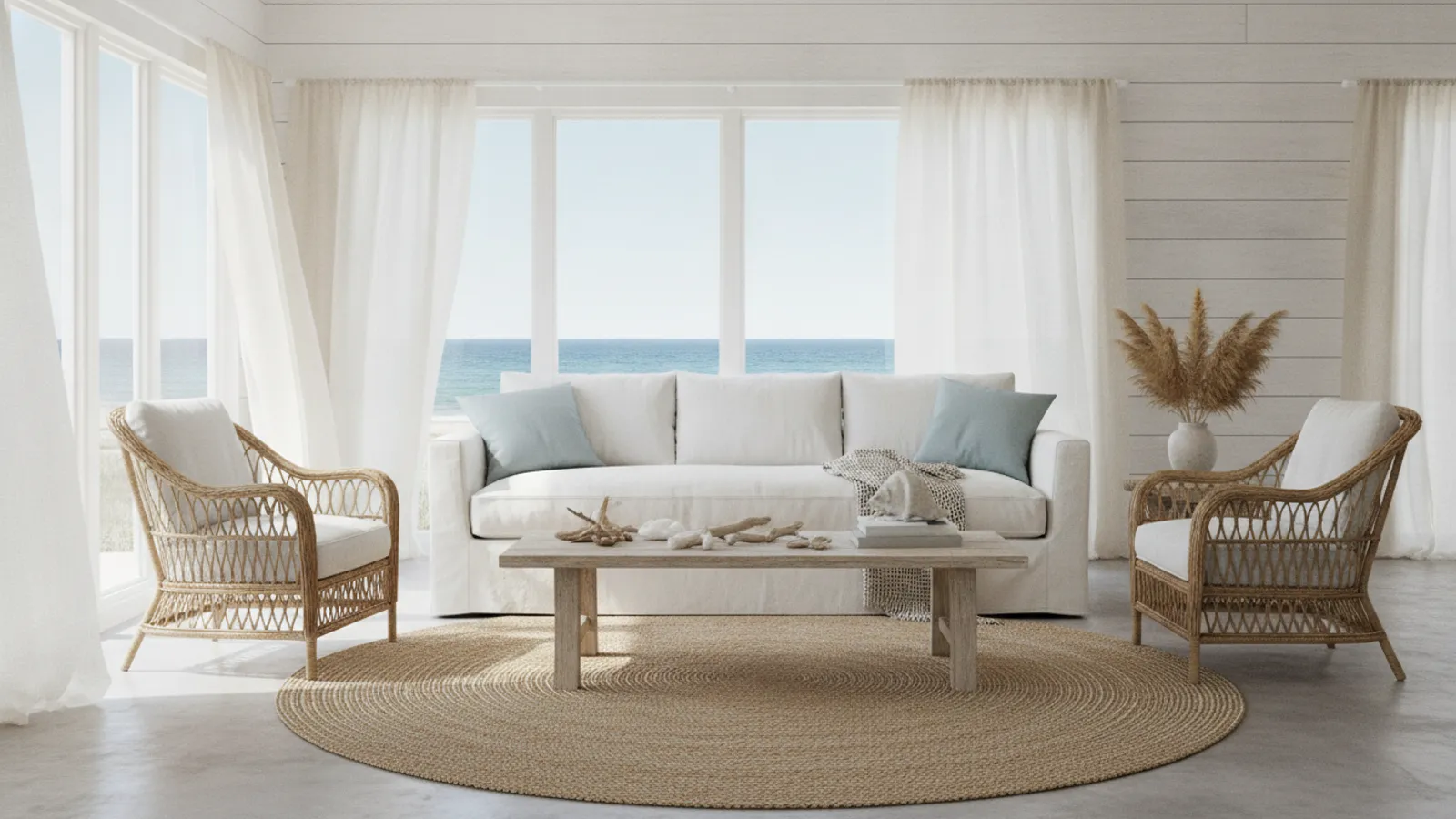
A chunky wool throw and warm-white walls lean Scandi. A handmade ceramic vase and a charcoal linen cushion lean Japandi. Both are valid — Japandi simply adds a Japanese layer of restraint and contemplation.
Transform Your Space With AI
Ready to see how Japandi would look in your actual room? Upload a photo to our AI interior design tool and apply the Japandi style in seconds — no commitment, no cost. The tool renders your space with the warm neutrals, low furniture, and natural materials that define the style, giving you a realistic preview before you touch a single wall.
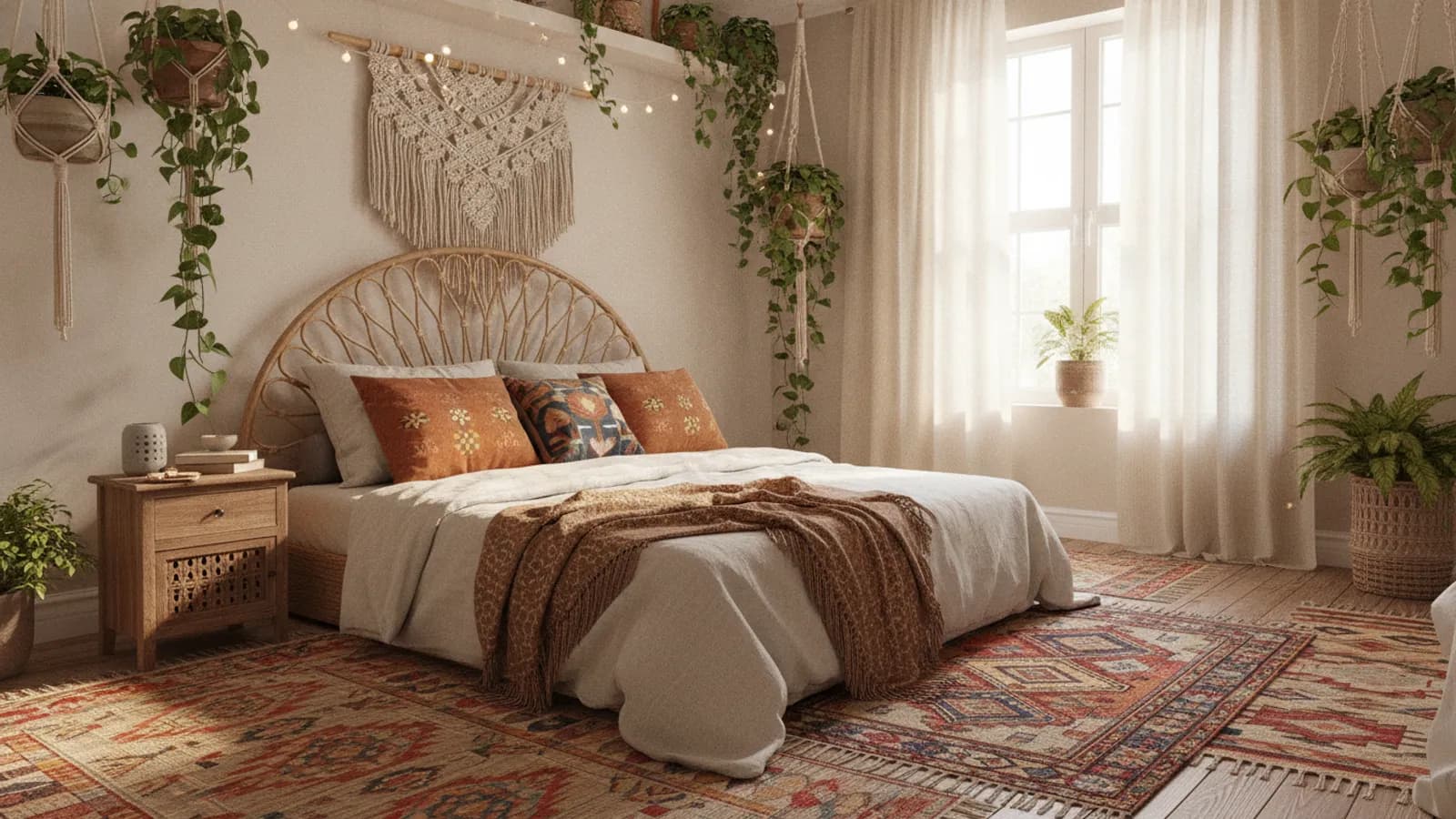
You can also explore the style transfer tool to blend Japandi with other influences, or browse our style gallery for more inspiration across both interior and landscape design. If you like Japandi's restraint but want a different mood, compare it with our modern minimalist and contemporary interior design guides, or add handmade warmth with the bohemian interior design guide.